|
本文由微信公众号视筑工厂(公众号ID:zs-factory)授权在本站发布 若需转载,请联系原公众号
微信扫一扫关注该公众号
声明:本文非视筑工厂原创,转载自Alex Hogrefe的博客,希望对各位的建筑表现之路有一定的帮助。我们深感自己能力不足,教程当然不会停止更新,但我们也需要反思,走的太快未必是一件好事。后续会再翻译一些Alex的文章或者是国外优秀的教程。另祝各位开学愉快~
点击文末的“阅读原文”即可转到原网址 正 This week, I got back into the Trench House project by generating some exterior vignettes. I wanted to use these images to emphasize the vastness of the context and also to explore some color combinations. Since this project sits in the middle of a desert in Nevada, the time it takes to Photoshop the surrounding environment is minimal which allowed me to generate several illustrations quickly and spend a little more time on the exploring the art side of things. Below, I explain some of the concepts and reasoning behind this set of images.
这周,一些室外的插图吸引了我回到Trench House项目。我想要使用这些图片强调广阔的背景并探索一些色彩的组合。由于该项目坐落在内华达洲沙漠的中心地带,通过Photoshop合成周围环境所花费的时间最少,这允许我很快的画一些插图并花费一多点儿时间探索事物的艺术方面。下面,我将解释这组图像背后的一些概念和推理。 1.Distance 相机
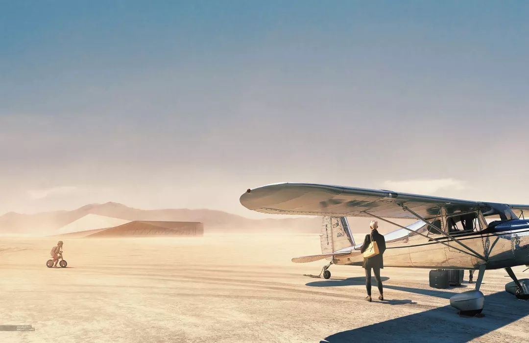
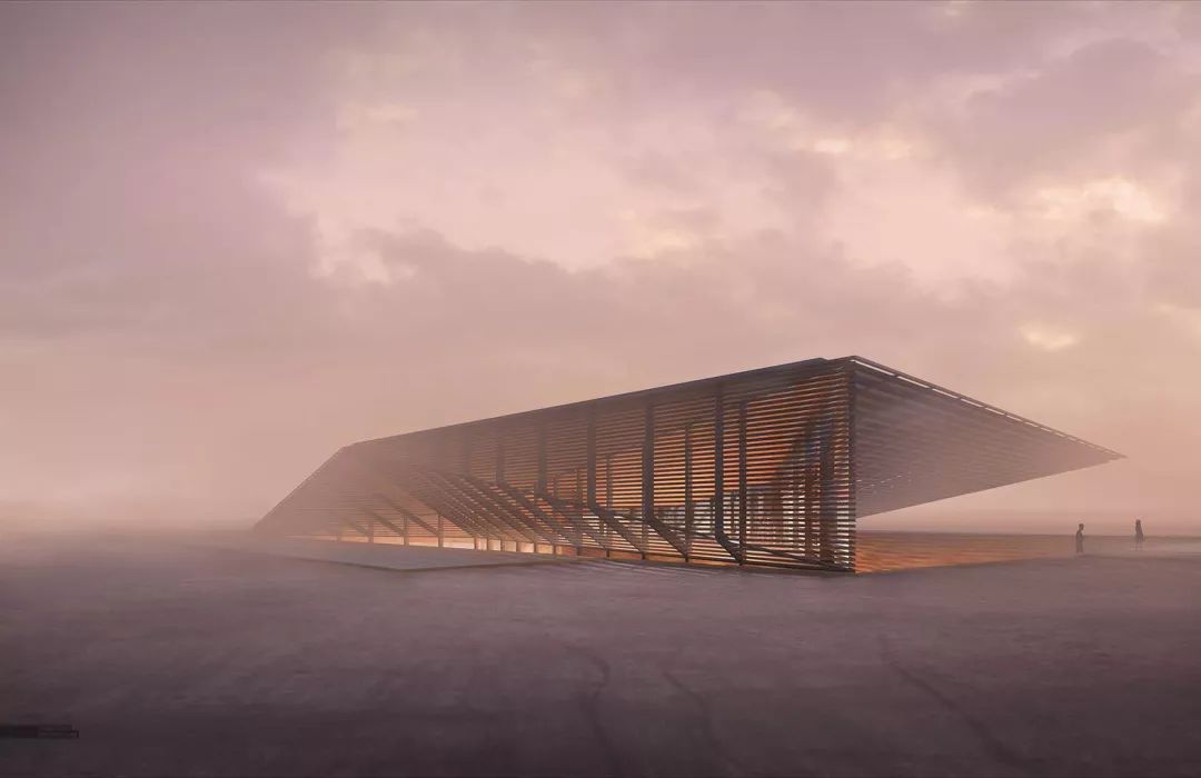
As I mentioned above, one of the goals of these images was to reveal the vastness of the surrounding site. I did this two ways. First, I pulled back the camera so that the architecture only made up a small portion of the image. Going through school, I was always afraid to make my design so small in the image because there was always a sense that I needed to show as much detail as possible in the architecture. Making the building so small within the image meant a lot of the detail was getting lost. However, now I realize that this move is in many ways advantageous. Since the detail is abstracted, it forces the viewer to focus on other elements such as the profile of the architecture or in this case, the landscape around it. I also played up the vastness of the site by letting the sky and ground textures do a lot of talking in the images by using some dramatic cloud formations and strong directional elements like the tire ruts in the ground.
正如我上面提到的,这些图像的目标之一是揭示周围场地的广阔。我用两种方式完成。首先,我把相机镜头往回拉,这样可以使建筑只占图面的一小部分。上学以后,我总是很害怕让我的设计在图面中占很小的一部分。使建筑在图面中占的比例很小意味着众多细节都会失去。但是,现在我意识到这一举动在许多方面都是有益的。由于细节是抽象的,所以它强迫了看图者将注意集中于其他因素比如建筑的外形,或者,在现在的情况下,周围的景观。我同样也通过使用一些引人注目的云层和强烈的方向性元素比如说地面上轮胎的车辙来增大天空和地面材质在图面中的叙事从而夸大了场地的广阔。 2.Composition 构图
I kept things pretty simple and safe with the composition. Again, I wanted to play up the landscape, so I kept the horizon at the lower 1/3 of the images so that the sky would take up more real estate. I eye-balled a lot of these camera setups, so there are several near-misses in terms of where geometry and focal points are landing on the 1/3 marks of the image (corner of the the building in view 02 and placement of the woman in view 01)
我保持了建筑在构图中的简单肯定。同样的,我仍然想要夸大周围的景观,因此我保持地平线比图面的1/3略低,这样天空可以占据更多的地方。我见过大量类似的相机设置,因此根据几何焦点在图像的三等分点(图2建筑的角落和图1女人位置的视角)的位置是有几个误差的。 3.color 颜色
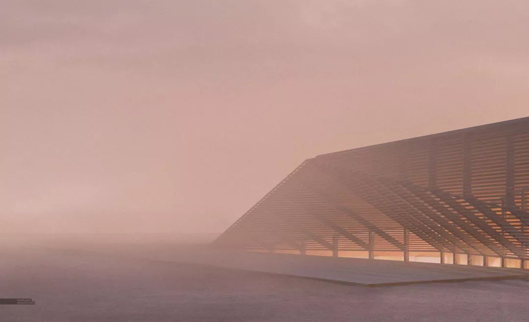
With the location being in the desert, it is easy for the scenes to get somewhat monotonous, so I gave each scene a primary color to start with. In each case, I used dust and dirt in the air to reinforce the arid climate atmosphere with the night scene getting a little more clear and cold feeling. As I mentioned above, there wasn’t a lot of time needed in Photoshop adding in texture and detail which meant I was able to spend more time experimenting with color.
由于场地在沙漠中,场景很容易变得单调,所以我在开头就给了场景一个基调。每种情境,我使用雾气和污浊的空气烘托干燥的环境,夜景可以获得一个稍清晰与清冷的感觉。就像我上面提到的那样,在PS后期中不需要花费太多的时间增加材质与细节,这也意味着我可以有更多时间测试色彩。


I had a lot of fun making these images. I would say all of these images hit my sweat spot in terms of balance between time spent modeling, Photoshopping in detail and texture, and experimenting with color and atmosphere. In terms of difficulty, these were actually quite easy. I am thinking one of these may be a good candidate to break down further into more detailed explanations of each step of the process. Stay tuned.
画这些图很有意思。我想说所有这些图冲击了我在模型、PS后期细节与材质、测试色彩与氛围之间保持平衡的最有效点。至于难度,事实上很简单。我想这其中的一张图可能是一个很好的,可以划分更多的每一步骤细节解释的候选图。敬请期待!
关于作者 I created this website in the summer of 2009 while a student at Miami University of Ohio working towards a Master of Architecture degree. The original intention was to use the website as a means to communicate to my instructors the progress I was making on my thesis work. However, the site quickly turned into a place to upload all of my thoughts, work, and experiments, whether it had to do with thesis or not. While my background has always been architecture, I’m constantly experimenting with all things visual. I still post my photography and drawings as these mediums play a large part in my understanding of proportion, layout, composition, lighting, and many other factors that directly relate to architectural illustrations. At the end of the day though, it all comes back to architecture and architecture illustrations. It’s my biggest creative outlet and what I live to do.
Before college, I lived most of my life in the corn fields of Northwest Ohio in the small town of Deshler(Look it up). After grad school in 2010, my wife and I moved to Boston, MA to work as an architect. I spent 4 years in the field before deciding to focus on architecture visualization full time in 2014.
I am now part of a new architecture visualization studio called Design Distill, in Boston, MA. I am partnering with Andrew Hartness to create a studio that generates unique and compelling illustrations for architects around the world.
我于2009年夏创立了博客,当时我还是一个迈阿密大学俄亥俄分校攻读建筑学学士学位的学生。创立之初只是用网站来交流介绍我的在完成我论文时的进度。但是,很快,博客就变成了一个上传我所有想法、工作、实验的地方,不论它是否与论文相关。由于我的背景总是与建筑相关,我时不时的实验一切事物的可视化。我仍然上传我的摄影、绘画因为这些中介物占据了我理解比例、布局、构图、灯光和其他一些直接与建筑插画有关的很大一部分。日后,这些都会回归到建筑与建筑插画中。这是我最富创造的宣泄也是我只要活着就要做的。
大学之前,我的大部分人生在一个俄亥俄西北的玉米田...2010年毕业以后,我的妻子和我搬到了马萨诸塞州的波士顿,作为一名建筑师工作。在我2014年决定专注于全职建筑可视化工作之前我花了4年时间在那里。
现在我是一个新建筑可视化工作室的成员,位于波士顿。我与Andrew Hartness合作创立工作室为全世界各地的建筑师创造独特又引人注目的插画。
|