本帖最后由 jane_w 于 2013-5-17 17:59 编辑
本文由E拓建筑网www.eeeetop.com的jane_w 翻译,转载必须保留以上信息!
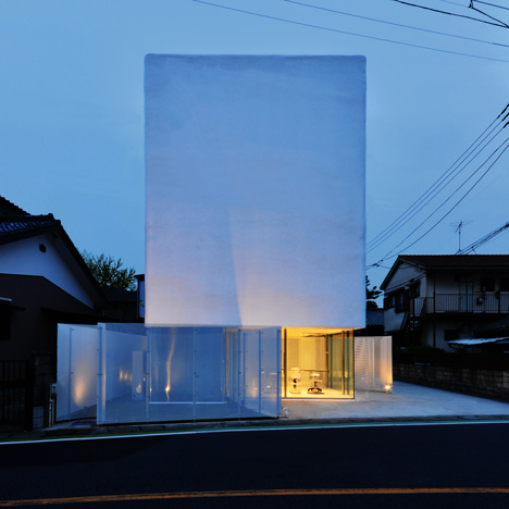
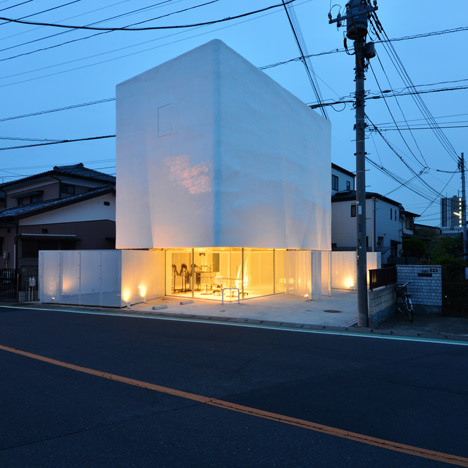
An opaque box appears to balance over see-through walls of glass and perforated steel at this house and pet shop in Saitama, Japan, by architecture studio N Maeda Atelier. 这个住宅兼宠物店位于日本琦玉县,是由N Maeda Atelier建筑工作室设计的。从外观上看起来,仿佛是一个不透明的盒子由透明的墙(由玻璃和穿孔钢)支撑着。
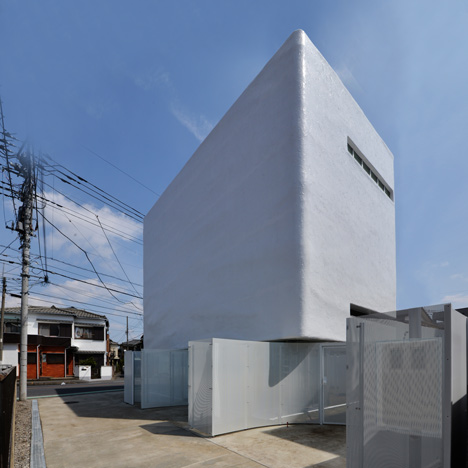
The pet shop occupies the ground floor of the building, while a two-storey house is contained in the precarious-looking upper volume and overhangs the glass facade to create a sheltered entrance to the shop. 宠物店占据了建筑的地面层,两层的住宅位于上层看起来不确定的体量之中,它伸出玻璃立面,为商店的入口提供遮蔽。
"The upper unit presents a sharp contrast to the open, transparent lower layer, with its weighty, massive appearance almost like a heavily-armed tank defending the rather indoorsy life of the client's family," says N Maeda Atelier. “建筑的上下层形成鲜明的对比,下层空间开放而透明,而上层单元沉重厚实,看起来近乎于一个全副武装的坦克,保卫着业主家庭的颇为居家(编者注:其实就是“宅”)的生活。”N Maeda Atelier说。
The plaster-covered walls of the house have a textured surface that the architects based on an image of a cloudy sky, with the same variations of light and dark. There are no sharp edges, as all four corners are chamfered.
房屋的抹灰墙的表面有纹理,建筑师设计的初衷源于阴霾的天空的形象:它们的共同之处是都有明暗的变化。建筑里没有尖锐的边缘,因为所有的四角都被斜切处理过了。
"On a cloudy day, the floating mass looks as if it blends in with the sky, while its edges lose their individual materiality as they melt into the gradational clouds in the background," says the studio.
“在阴天的时候,(墙上)漂浮的团状物看上去仿佛融入了天空,而它的边缘仿佛失去了个体的物质性,因为他们融化在背景的层层云朵中。”工作室的相关人员解释。
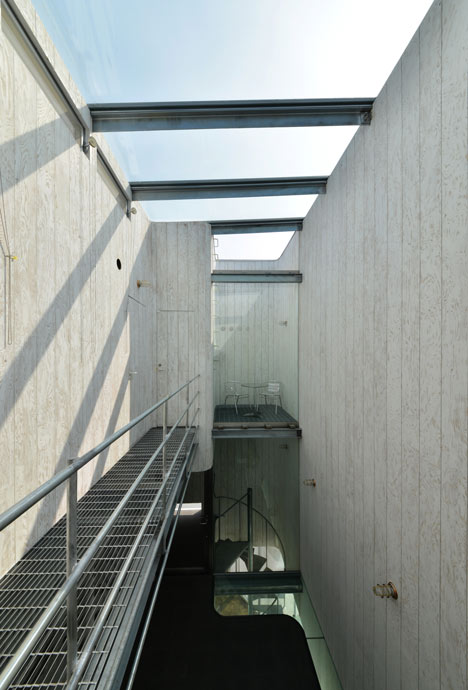
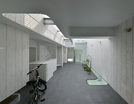
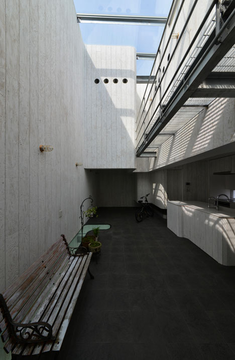
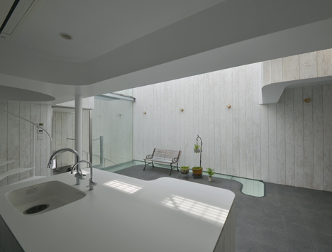
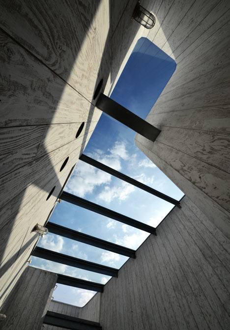
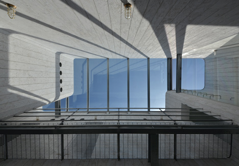
Natural light floods into the house through a skylight that stretches across most of the roof. Rooms are arranged around a double-height atrium, allowing light to permeate most of the interior.
自然光通过划破大部分屋顶的天窗射入房屋内部。房间围绕一个双层高的天井组织,使得光线能够射入室内的部分地方。
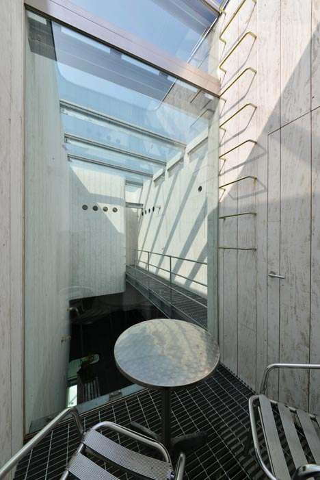
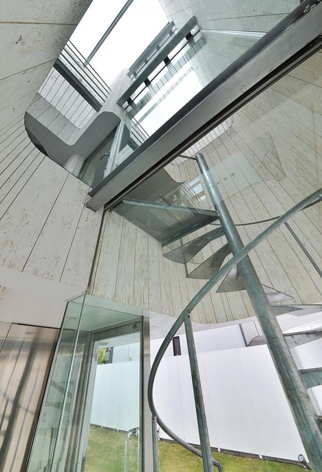
A kitchen, lounge and traditional Japanese room occupy the lowest level of the residence, while a spiral staircase leads up to a gridded metal mezzanine with a bedroom and bathroom beyond.
厨房,休息厅和传统的日本房间占据了住宅的最底层;旋转楼梯间引领我们来到由金属网格做成的夹层;夹层旁边有一个卧室和一个洗手间。
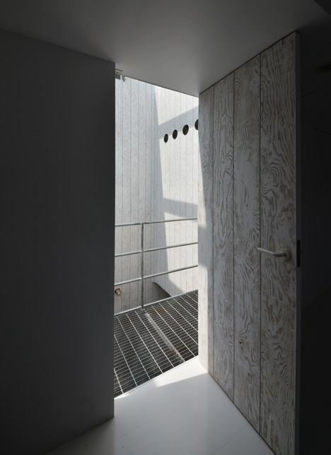
In contrast with the austere facade, the interior walls are lined with plywood, which the architects have sliced up into boards and coated with a thin layer of white paint.
与朴素的立面相对比,内部的墙使用排列的胶合板(建筑师将它们切成板片,并涂有一层白色薄漆)。
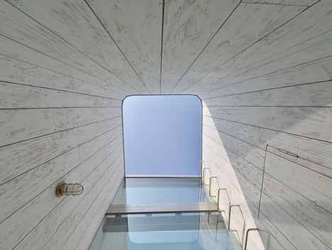
The owner of the residence also runs the pet shop downstairs, so a second spiral staircase leads down from to the "dog-run" yard at the back of the building.
房屋的主任同时经营楼下的宠物店,所以(需要)一个次要的旋梯从这里通往建筑后面的“狗奔”院。
Here's more information from Norisada Maeda:
以下是来自Norisada Maeda的更多信息:
TORUS: Transcribing the Sky onto the Façade TORUS:把天空转录为立面
Composition: First Floor 创作:首层平面
Basic composition of TORUS is a bilayer structure consisted of a white, half-amorphous box floating on the lower layer softly surrounded by glass and perforated aluminum panels. TORUS的基本创作是一个由一个白色的半模糊不定的盒子漂浮在(由玻璃和穿孔铝板柔和地包围的)较低一层上。
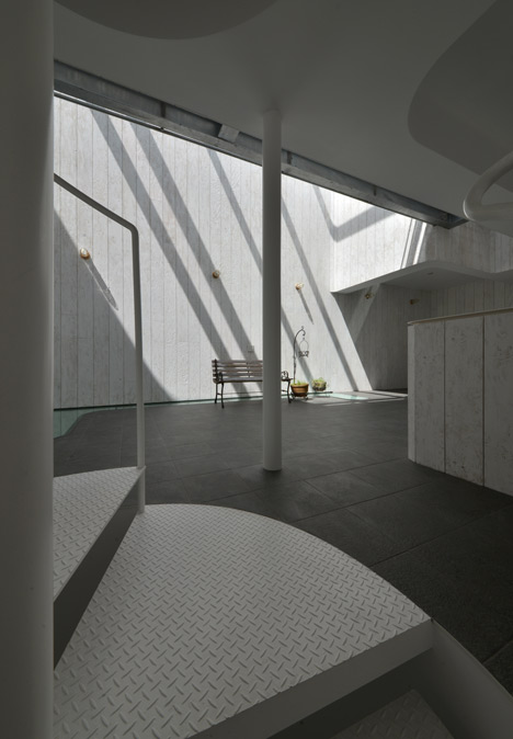
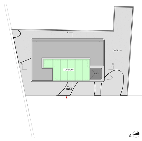
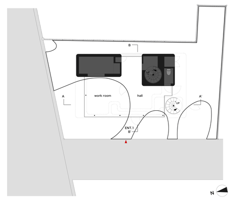
The transparency and the openness of this layer is a natural solution for the functional requirement to expose the presence of the salon to prospective customers and other passer-bys, as well as to open up the ground outside the shop area surrounded by the curved perforated partitions as "dog-run" field where dogs can freely run around.
这一层(首层)透明而开放,这是对于它的功能需求的自然解决方式:沙龙的活动需要让可能的顾客和其他的过客很好地看到,把商店区域外面的被曲线型穿孔隔墙包围的区域打开,作为“狗奔”院,使小狗可以自由自在地在周围奔跑。
The apparently free line of the curved wall is actually based on our careful recognition of what we call the "welcoming zones", i.e., the pocket areas required to open up to the urban context outside the building site. The cutting-outs of such zones as parking, entrance and spaces for outdoor equipment have resulted in the irregular curve of the wall as the output of such operations.
曲线型的墙看上去是自由的线条,实际上我们是基于细心地认知我们所讲的“欢迎区域”设计的,比如说,袋形区域需要对建筑基地外的城市环境打开。这些区域被停车,入口和室外设施所切断,这又造成了墙体的不规则的曲线形状,这种形状正是这些活动的产物。
Composition: Second and Third Floors
创作:二层和三层
The upper unit containing two floors within presents a sharp contrast to the open, transparent lower layer with its weighty, massive appearance almost like a heavily-armed tank defending the rather indoorsy life of the client's family. With a closer look, the surface of the wall shows a texture similar to a handmade pottery instead of that of a flat, uniform industrial product. 上层单元(包含有两层楼)沉重厚实的外表几乎像是一个重重(音:chongchong)武装的坦克保卫着业主的居家生活,与下层的开放透明形成鲜明对比。近看,墙体的表面纹理像陶,而不是平整统一的工业产品的那种质地。
Texture: Exterior Wall
质地:外墙
The pottery-like texture is the result of painstaking manual operation of repeatedly applying and spreading the waterproof material onto the wall. Beside such a consideration to the close-up texture, the exterior of this second layer also involves our sensitivity to the longer-distance outlook of the building, which is realized by an operation of transcribing the sky onto the wall. 表面近似陶的质地是通过辛苦地反复涂抹防水材料做成的。除了考虑到近距离观看的材质, 二层的外部设计同样融入了我们对于建筑远观效果的体察,它是通过将天空转译(transcribing)到墙体上来实现的。
Interior composition: Internal Void (through second and third floors)
室内创作:内部的空旷(通过二层和三层)
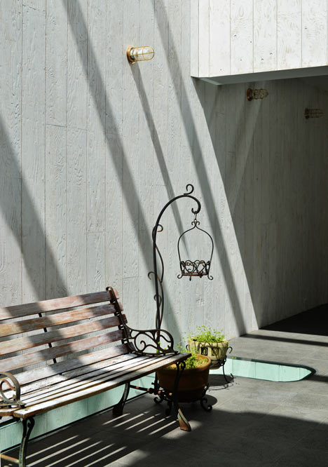
Let us move up into the massive floating box, which appears extremely exclusive of the surrounding urban context. Beside the entrance door is a small pocket space: although it is still an open-air space, it somehow bears an indoor atmosphere due to the careful treatment of proportions and openings. Right inside the entrance door is a huge void within the massive box. 让我们接着来到漂浮盒子的部分,看上去它似乎是非常排斥周围的城市环境的。入口门旁边是一个小的袋形空间:虽然它仍然是一个室外的空间,但由于对比例和开口的仔细处理,它在某种程度上拥有室内的气氛。入口门内的正是厚重盒子内的巨大的虚空间。
site plan
总平面图:
ground floor plan
首层平面图
|